
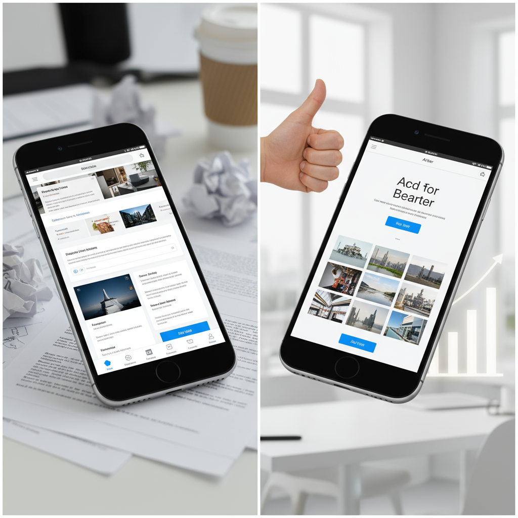
In today's digital landscape, the phrase "mobile-first web design" isn't just a buzzword; it's a fundamental requirement for online success. With a staggering majority of internet users accessing content via smartphones and tablets, designing for the smallest screen first has become paramount. For businesses in Myrtle Beach, SC, embracing mobile-first isn't just about keeping up; it's about staying ahead, capturing local traffic, and providing an optimal user experience that converts visitors into loyal customers. At innovAIt Media, we specialize in delivering cutting-edge, mobile-first websites that establish a powerful online presence for your brand.
But what exactly does mobile-first mean, and why is it so crucial? Traditionally, websites were designed for desktop computers, with mobile responsiveness added as an afterthought. This "desktop-first" approach often resulted in clunky, slow, and frustrating mobile experiences. Mobile-first design flips this paradigm on its head, prioritizing the mobile user experience from the very beginning. This ensures that your website is inherently optimized for performance, usability, and search engine visibility across all devices. You might also find value in Will AI Steal Your Insurance Clients A Portland Or.

Why Mobile-First Design is Non-Negotiable for Modern Businesses
The statistics speak for themselves. Mobile devices now account for over 50% of global website traffic. Google also uses mobile-first indexing, meaning its algorithms primarily consider the mobile version of your website for ranking and indexing. If your site isn't mobile-friendly, you're not just losing potential customers; you're actively hindering your search engine performance. This connects directly to Atlanta Ga Will Ai Break This Bakery Or Make It.
Key Benefits of Mobile-First Web Design:
- Superior User Experience (UX): Fast loading times, easy navigation, and readable content enhance user satisfaction.
- Improved SEO Rankings: Google rewards mobile-friendly sites with higher visibility in search results.
- Higher Conversion Rates: A seamless mobile experience encourages visitors to complete desired actions, like making a purchase or filling out a contact form.
- Future-Proofing: Designing for mobile ensures your site adapts to new devices and screen sizes.
- Accessibility: Often results in better accessibility for users with disabilities.
Understanding these benefits is the first step. The next is implementing the right web design services to achieve them. innovAIt Media provides affordable web design solutions tailored to meet these modern demands. As we covered in Can Ai Really Work For Pest Control In Boise Id Achieving Op. You might also find value in AI automation solutions.

Core Mobile-First Web Design Best Practices
1. Prioritize Content and Functionality
When designing for mobile, simplicity is key. Screen real estate is limited, so every element must serve a purpose. Identify the most critical content and functionalities for your users and make them instantly accessible. This often means decluttering layouts, streamlining navigation, and focusing on clear, concise calls-to-action (CTAs). Industry leaders are also reading Why Your Team Resists Is AI A Hidden Trap For Rv B.
2. Optimize for Speed
Mobile users are notoriously impatient. Slow loading times are a deal-breaker, leading to high bounce rates. To ensure your site loads quickly, focus on: This aligns with insights from Demystifying Ai For Family Law Crm Beyond The Hype.
- Image Optimization: Compress images without sacrificing quality. Use modern formats like WebP.
- Minify CSS, JavaScript, and HTML: Remove unnecessary characters from code.
- Leverage Browser Caching: Store frequently accessed resources locally.
- Choose a Fast Host: This is fundamental for performance. innovAIt Media includes premium hosting with all our website packages.
3. Responsive Layouts and Fluid Grids
While the term "mobile-first" often implies a separate mobile experience, the goal is actually a truly responsive design. This means your website's layout fluidly adapts to any screen size, from the smallest smartphone to the largest desktop monitor. Use flexible grids, images, and media queries to ensure your content always looks and functions perfectly, regardless of the device. This is a hallmark of the custom website design we provide. For practical steps, see Virginia Beach Va Is Ai Seo A Game Changer Or Costly Distrac.
4. Touch-Friendly Navigation and UI Elements
Finger taps replace mouse clicks on mobile devices. Design your navigation menus, buttons, and other interactive elements to be easily tappable. Buttons should be large enough (typically 44x44 CSS pixels) and spaced adequately apart to prevent mis-taps. Implement clear breadcrumbs and intuitive menu structures (like hamburger menus) for easy site exploration. Related insight: Detroit Mi Service Businesses The Ai Ethics Crisis No Ones T.
5. Readable Typography
Text on small screens can be challenging to read if not optimized. Choose legible fonts, ensure sufficient font sizes for body text (aim for at least 16px for readability), and maintain good line-height and letter-spacing. Contrast between text and background colors is also crucial for accessibility and comfort. This pairs well with The Ugly Truth About Ai Risk For Chiropractors.
6. Streamlined Forms and Data Entry
Filling out forms on mobile can be tedious. Simplify your forms by asking only for essential information. Implement features like auto-fill, input type attributes (e.g., type="email" for email fields), and numeric keypads for phone numbers to make data entry quicker and easier. Our advanced contact forms, included in our PRO and ENTERPRISE packages, are designed with mobile user experience in mind. Worth exploring: The Awakening Why Jewelers Nationwide Cannot Afford To Wait.

7. Local SEO Optimization for Myrtle Beach Businesses
For businesses serving the Myrtle Beach, SC area, mobile-first design goes hand-in-hand with local SEO. Mobile users are often searching for local services "near me." Ensure your website prominently displays your business name, address, phone number (NAP), and embeds a Google Map. Optimize your content with location-specific keywords. Google's mobile-first indexing significantly impacts how local search results are displayed, making a responsive site essential for attracting customers from Conway, North Myrtle Beach, and beyond. Complementary reading: How AI Is Changing Accounting And What Youre Missi.
AI-Powered Design & 48-Hour Turnaround!
At innovAIt Media, we leverage cutting-edge AI technology to rapidly develop stunning, mobile-first websites. Our unique process allows for an unprecedented 48-hour turnaround for initial designs, getting your business online faster than ever. Combined with our all-in-one packages, we make getting a professional web presence a breeze. Learn more about how our process works. Building on this, see Your Competitors Are Lying The Truth About Ai Scheduling For.
Implementing Mobile-First with innovAIt Media
Adopting mobile-first web design best practices can seem daunting, but it doesn't have to be. innovAIt Media takes the complexity out of building a high-performing, mobile-responsive website. Our AI-powered design process ensures that from concept to launch, your site is optimized for every screen size, delivering a seamless experience that resonates with your audience. For a deeper look, explore Karbon Ai For Salons The Honest 2026 Review.
- BASIC Package: Starting at $495 setup + $29/month, includes a 3-page, mobile-responsive website with 1 SEO-optimized page.
- PRO Package: For $695 setup + $49/month, get up to 5 pages, 3 SEO-optimized pages, local SEO optimization, and social media integration. Perfect for growing businesses.
- ENTERPRISE Package: At $895 setup + $69/month, enjoy up to 7 pages, 6 SEO-optimized pages, advanced content strategy, and 24/7 priority support.
Every innovAIt Media package includes essential features like mobile-responsive design, Google indexing, excellent hosting, and ongoing maintenance. We don't just build websites; we craft digital experiences designed to grow your business. You can view some of our recent creations in our portfolio.

Frequently Asked Questions About Mobile-First Web Design
Q1: Is mobile-first design only important for e-commerce sites?
A: Absolutely not! While e-commerce sites certainly benefit from optimized mobile experiences (leading to higher conversion rates), mobile-first design is critical for all types of websites. From local service businesses in Myrtle Beach looking for new clients to blogs and corporate sites, a poor mobile experience deters visitors and harms SEO. Every online presence benefits from prioritizing mobile users. This connects directly to our earlier analysis on Small Business Web Design Myrtle Beach.
Q2: How is mobile-first different from responsive design?
A: Responsive design is about making your website adapt to different screen sizes. Mobile-first design is an approach within responsive design. Instead of designing for desktop and then shrinking it down, mobile-first starts with the smallest screen. This means prioritizing content, performance, and touch interactions for mobile users from the outset, then progressively enhancing the experience for larger screens. All innovAIt Media websites are built with this mobile-first responsive approach. As we covered in our earlier analysis on How To Choose The Right Web Designer Myrtle Beach.
Q3: How often should I update my mobile-first website?
A: The digital landscape is constantly evolving. Regular updates are crucial for security, performance, and keeping up with new design trends and search engine algorithms. innovAIt Media includes ongoing maintenance and updates in all our packages. Our BASIC package includes 1 update/month, PRO includes 2 updates/month, and ENTERPRISE offers 4 updates/month, ensuring your site always remains fresh and functional.
Ready to Elevate Your Online Presence?
Successfully navigating the modern web requires a mobile-first mindset. Don't let an outdated or desktop-centric website hold your Myrtle Beach business back. At innovAIt Media, we combine artificial intelligence with expert design principles to deliver fast, beautiful, and highly effective mobile-first websites, often with a 48-hour turnaround for initial designs.
Whether you need a basic online presence or a comprehensive digital strategy, our affordable, all-in-one packages are designed to propel your business forward. Discover how easy and effective web design can be. Contact innovAIt Media today for a free consultation and let us build a mobile-first foundation for your online success!
Mobile-First Web Design Best Practices ensure optimal user experiences across all devices. Implementing Mobile-First Web Design Best Practices improves search rankings. Mobile-First Web Design Best Practices are essential for modern websites. Our team follows Mobile-First Web Design Best Practices in every project.